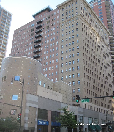
3-Bedroom Contemporary Renovation With Lake Views: 40 E. 9th in the South Loop
This 3-bedroom in 40 E. 9th in the South Loop came on the market in October 2015.
The listing calls it “architecturally renovated” in the contemporary style.
It has north and east exposures with 2 of the 3 bedrooms facing east with some lake views.
It has a beamed ceiling and stained concrete floors along with contemporary finishes.
There’s an 8 foot wet bar.
The Master Suite has an equipped office with lake views and a spa-like bathroom with a walk-in rain shower and two closets.
The kitchen has wood modern cabinets but everything else is stainless including the appliances, counter top and sink. There’s a wine fridge.
The unit has central air and washer/dryer. It doesn’t say parking is included but it looks like it has a garage space.
Priced at $794,000, is this another sign that the South Loop is on its way to a full condo recovery?
Brenda Mauldin at Baird & Warner has the listing. See the pictures here.
Unit #1406: 3 bedrooms, 3 baths, 2000 square feet
- Sold in November 2014 for $350,000
- Originally listed in October 2015 for $794,000
- Currently still listed at $794,000
- I can’t tell if that price includes a parking spot or not
- Assessments of $1214 a month (includes a/c, doorman, cable, exercise room, exterior maintenance, scavenger and snow removal)
- Taxes of $6650
- Central Air
- Washer/Dryer in the unit
- Bedroom #1: 21×20
- Bedroom #2: 15×11
- Bedroom #3: 17×10

I don’t usually like to use these words to describe interior design because the words lack any rigor, but this place just looks cheap and tacky…
It does not look tacky to me, but I find the arbitrary space dividers in the 2 of the bedrooms weird and those random greenery here and there makes me think I am in a Thai restaurant.
I think I found something I hate more than diagonal floors… diagonal rectangular tile!
So many effin wierd textures in this place, it looks like a great place to trip on some acid but to live… yikes I really hope that the “one wall of goofy designer wallpaper” isn’t a new trend
I will say that master bath looks kind of neat even though impractical (no closed storage)
I like some aspects of this place, others not so much. But with all the effort that went into the reno and furnishings, that t.v. in the living room looks silly.
FUG-LY
This is the weirdest damn building. I don’t know what the deal was with it but it looked like widespread mortgage fraud to me back in the day but even that didn’t explain some of the weird stuff I saw.
http://www.chicagonow.com/getting-real/2011/01/follow-up-on-the-mysterious-burnham-park-plaza-condos/
“So many effin wierd textures in this place”
totally agree. my eyes hurt looking at this place. the tiled floors with heavy graining, the ceilings (what are they anyway, metal?) , backsplash on the bar, wallpaper and faux paint finish, the plant wall…this place needs to be toned down. add to that the mirrored wall next to the bar reflecting it all. even some of the light fixtures have patterns. jeez
The TV in the bedroom looks silly too. I feel like they picked up both TV stands at Tuesday Morning or a Home Goods type operation. Then again I have a personal aversion to having a TV in the bedroom in the first place. The textures and patterns certainly don’t help but in addition they have so much stuff the photos make the place look cramped.
I think they clearly went through great effort to stage this place and it might be the rare example where they need to do “less” staging – – e.g. put all the area rugs and individual chairs in storage. Get rid of most of the artwork. Despite the minimalist “steam punk” style(if that is even the correct name for what they were going for), it is oppressive and hard to visualize what your own stuff would look like in there. Also, shame on that kitchen reno. If they hid the appliances with panel ready versions they would actually have a cool looking kitchen instead of that headache inducing thing.
Too much going on. Reminds me of the star wards prequels. I don’t know where to look and weird combos are making me nervous.
It seems like they tried to combine every possible element of the “steam punk” design Liz mentions. It’s just too much.
I call this style Moldovian .. you know, like some eastern european from a god forsaken country like Moldova escaped communism to live in the west, falls backwards into some money, and furnishes his or her home in the ‘modern’ or ‘contemporary’ style with reckless abandon. So you end up with diagonal tiles, fake wood beams on a concrete ceiling, and a mish-mash of other styles that don’t make any sense, sort of like how Jack from it’s a Nightmare before Xmas tries to recreate Christmas but doesn’t know WTF he’s doing.
The NW side and NW suburbs are filled with eastern european homes with red wall paper, stripped ikea kitchen cabinets, diagonal flooring using some off color/brand laminate, one bathroom from home depot the other from ikea…
This place isn’t that bad, not really to my taste but there’s so much worse out there.
These guys are DIY flippers. Great location and square footage, but you’ll have to undo all their shitty carpentry and adderal induced stage-ry. Brutal HOA fees!
I assume there is a high correlation between HOA fees and the age of the building. This was built in 1914, so high HOA fees are part of the package for living in a 101 year-old building.
High HOA fees correlate with poor management and an association in debt.
Now at $749k.