The Lakeview Tuscan Villa is Back! 2965 N. Sheridan
In November 2007, we chattered about this Tuscan-inspired renovated single family home at 2965 N. Sheridan in Lakeview.

It was withdrawn from the market.
It has recently been re-listed and is now reduced $520,000.
If you recall, it has a neat atrium in the middle of the house (but there are no pictures of the atrium in the new listing.)
Here’s the listing:
LUXURY LIVING WITH INTERNATIONAL AMBIENCE IN THE HEART OF CHICAGO’S GREEN COAST. ONE-OF-A-KIND 4BR/4.5 BA W/2STORY ATRIUM
OFFERS 4200 S.F. OF STUNNING OPEN SPACE ON 2 LEVELS.
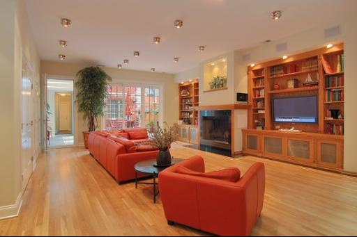
ALL OF THE ULTIMATE FEATURES, FIXTURES AND SYSTEMS THRUOUT. KITCHEN FEATURES SUBZERO, THERMADOR, BOSCH. GROHE/LA CAVA BATHROOM W/MOSAIC TILE, GORGEOUS HW FLOORS W/ IN LAY & GRANITE. 2 FP. LIVING RM W/CUSTOM BUILT-IN SHELVING OPEN …
Brent Rosenbower at Sudler Sotheby’s has the listing.


2965 N. Sheridan: 5 bedrooms, 4.5 baths, 4800 square feet, 2 car garage
- I couldn’t find an original sales price
- Previously listed in November 2007 for $2.8 million
- Currently listed for $2.28 million
- Taxes of $8,481
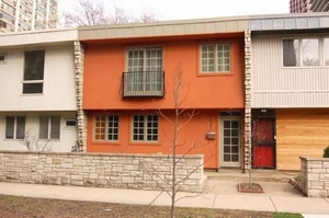
that first pic, from the front, makes it look kind of tiny. But it’s large. weird.
One of a line of houses (many in poor shape), overshadowed by tall buildings, on a street that is noisy day and night, and filled with someone else’s decorating choices. This would have to come down another 50% before it would be worth considering.
Even then, how much of one’s life would one mortgage for a really quite unremarkable property?
I have never understood how this complex demands the kind of prices it does.
The townhouses are not beautiful, and pasting a fake “tuscan” facade onto these mid-century modern townhouses really wrecks what aesthetic the place has. I’m surprised the association permitted it, because it looks truly awful.
Yeah that orange color is definitely disgusting. 1978 called and wants its paint back…
Truly, the orange facade is unattractive, but it is still better than the shipping container on a stack of wooden palettes to the right.
The whole fake “tuscan” look is horrid on a townhouse like this. It’s just so obvious that the facade is a “cartoon” or paste-on”. Worse, it really clashes with all the other townhouses.
I always thought that this was a junky-looking complex, but this makes it look even more like a cheap post-WW2 pre-fab subdivision.
It’s so tacky, they might as well put a “tuscan” fountain on the plaza out front, replete with pink plastic flamingos wading in it, and maybe a highly-colored religious statue or two, or three.
I used to walk past these almost daily when my wife and I were dating — she lived a block or so north of them and I was about 3 blocks south. I, too, was amazed that they’d be allowed to so alter the facade and I was even more amazed when I saw a real estate listing asking in the millions! I, too, thought they looked small from the outside and questioned the sq. ft. but a google maps satellite overhead seems to suggest that a couple of the units extend way back while others look about as deep as they are wide — is this the case?
this makes it look even more like a cheap post-WW2 pre-fab subdivision.
That was my first thought — the geometries of the place scream “1948 Shoebox,” at least from the front. While post-WWII architecture has some redeeming points, that facade sure doesn’t make a luxe first impression. Nor do I feel like I’ve suddenly teleported to, urm, Tuscany.
Seriously, $2.28 million?
>>a google maps satellite overhead seems to suggest that a couple of the units extend way back while others look about as deep as they are wide — is this the case?
Yes, this unit (2965) and one other (2961) were gut-rehabbed and extended backward, so that they’re much larger than the other units (about 4800 square feet each). 2961 is also back on the market, for $2.15M, down from an original $3M and subsequent $2.7M. The inside is more appealing, at least to me, than 2965. Still, there’s zero curb appeal and some of the neighboring units are in pretty bad shape.
Given the location, does the price factor in any development potential for the land? It’s surrounded by highrises but I haven’t checked the zoning.
Its not that bad. 4,200 sq ft is a lot of space for such a prime location. Sure the architecture is a bad tacky but this place isn’t as bad as you make it seem. The price is pretty high but its a unique place.
Prime if you like to listen to buses.
That has the curb appeal of a 300k home.
The typical $300K bungalow has more curb appeal than this, and probably much betnter architecture.
There is too much really beautiful stuff with plenty of room to be had in Lakeview for a lot less than $2MM.
Also, there is a similar complex on Wellington, with better architecture and better materials, and I remember seeing those places listed for around $350K back in the mid-90s. Could they really be worth 6X as much in this declining post-bubble market?
Excuse me, what is WRONG with my typing in that first sentance? I meant to say “better”.
All these buildings are disgusting. They remind me and look a lot like housing projects in the United Kingdom.
This is probably one of the funniest asking prices I’ve seen in awhile, though. Does the owner really think that if they list for 3 or 2.2 million some potential buyer will be willing to meet them halfway in any sort of negotiation?
Those who can pay 2 million usually want an abode to impress. This property fails to impress with the entrance. This development seems to be a muck job.
I believe these are fee simple townhouses, so technically there is no association and each owner is free to do whatever they choose with the untis. I heard that the developer of these mega-units bought 6 out of the 8 in order to tear them down, but the last two owners wouldn’t sell, so he did these remodels instead.
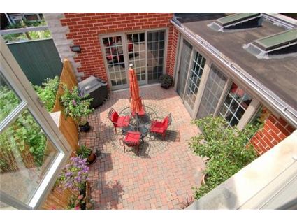
While this general location might be good (close to lake, etc), i agree with the above posters that a single-family type residence DIRECTLY on sheridan road is very undesirable. However, a nice outdoor space in the back, which this one appears to have, can help creat that ideal tuscan getaway in the city that we’re all lnging for.
Laura, those units are wellington are beautiful, but to they are in no way comps for these expanded townhouses – no parking and a third of the size.
the lots are 23′ x 150′ give or take. Obviously, the buildings extend lot line to lot line N/S, which allows for more width than a typcial single family on a 25′ lot. combine this with extra lot depth and high-density zoning and you can see how these are really large units.
I went into an open house at 2961, and while it might have been large, the layout was clumsy and awkward. good for them for managing to sell that in this market.
The “Tuscan” rehab of a modern townhouse is appallingly devoid of taste.
That whole row of townhomes have been aesthetically compromised with garbage modifications and “rehabs,” however, so whatever, I guess it’s no great loss.
Zoning is RM-6.5 which would allow highrises by right (one of the very few areas in the city that does at this point), but each of these rowhomes is subdivided into it’s own little parcel so a developer would need to assemble several contiguous lots to have a buildable site.
Except, I should add, these fall within the boundaries of the “Lakefront Protection Ordinance” so you couldn’t actually build a highrise by right, you’d have to go through the Alderman-and-neighborhood-“activist”-group extortion process to hope for approval.
The outside would probably have to be redone, but the inside looks really nice. Plus, noise isn’t too terrible a factor because the bedrooms seem to be in the back (like most units on busy streets). I’d pay a little over a million for this.
Saw this unit and the “spa” lookalike next door last year. These units are big and long, though extremely narrow, especially the stair cases. Location is prime when you’re a block from the lake.
The additions werre not bad. Although everyone calls this “tuscan” it is really spanish/barcelona/gaudi inspired. The owner/developers wife is from Spain and he redesigned to make her feel more comfortable. $1.75 is probably a pretty fair price for either.
Wow it’s like the ugly girl with the great personality house. The front looks like a freaking tenement. For 2.3 NEVER!!!!!! NEVER!!!!!! NEVER!!!!!!!!
The best looking trailer in a trailer park is still a trailer.
The picture actually makes the row look better than it normally
looks. I thought it was public housing the first time I saw it.