Back to the 1970s: 601 W. Dickens in Lincoln Park
There are a lot of 1970s buildings in Lincoln Park. 601 W. Dickens is one of them.
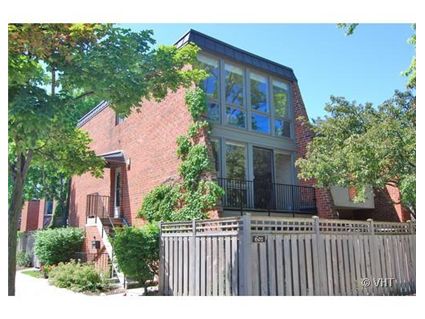
Built in 1973, the 2-bedroom duplex has been renovated.
Does that make you forget the lower ceilings?
Here’s the listing:
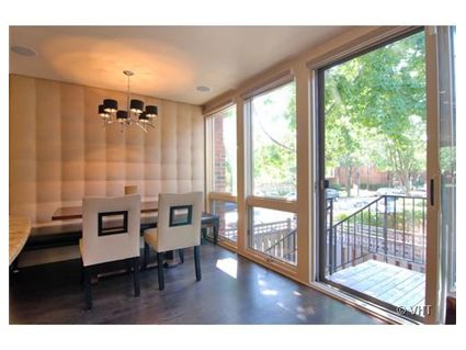
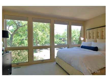
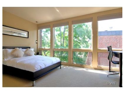
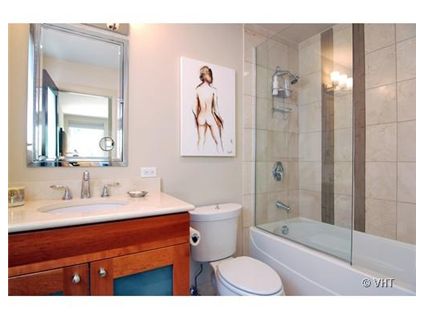
BEAUTIFULLY RENOVATED DUPLEX UP RIGHT ON OZ PARK! FLOOR TO CEILING WINDOWS IN EVERY ROOM; KITCHEN WITH CHERRY CABINETS GRANITE, STAINLESS APPLIANCES, GLASS BACKSPLASH; ALL MARBLE BATHROOMS; REFINISHED HARDWOOD FLOORS AND NEW CARPETING.
LARGE BALCONY OFF THE LIVING ROOM AND A PRIVATE LANDSCAPPED YARD. PARKING INCLUDED IN THE PRICE
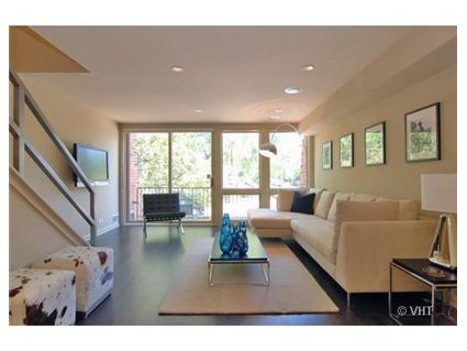
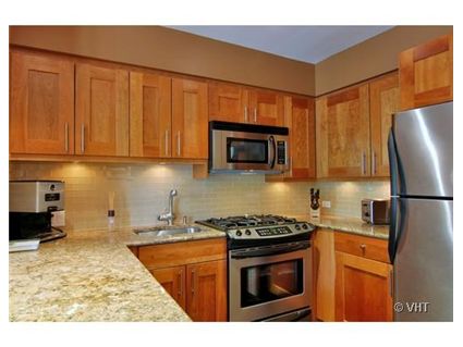
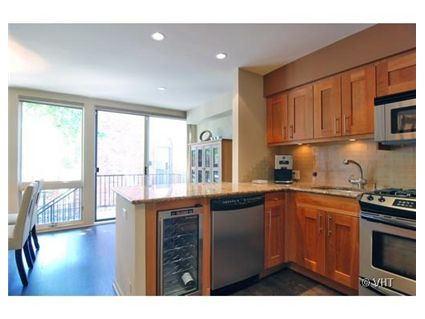
Unit #A2: 2 bedrooms, 2.5 baths, no square footage given
- Sold in October 2004 for $390,000
- Sold in January 2007 for $412,500
- Currently listed for $499,999 (parking included)
- Assessments of $140 a month
- Taxes of $5611
- Central Air
- @Properties has the listing
Seems a bit over priced but pretty.
One of the few examples of architecture from the 70’s that aged gracefully. Still overpriced, but not ugly. And thats saying a lot for that era. Someone should let them know 2006 called and wants their price back.
Looking at the sales history and the interiors, I have to assume that the current owner remodelled. So they spent $412K plus a bunch on work and are looking to make a profit. A few years ago, they would have been in good shape. Now, they will probably make a paper profit relative to the $412K (another data point for Steven), but will probably lose $100K overall.
I am completely in love with it. But then, I am a sucker for all that sunlight and that modern look. If anything, the granite looks out of place with the rest of the decorating.
I have to say they did a very nice job on the remodel, but agree that this is no longer 2006 or 2005, so why they are still in flip mode pricing is curious. Is the parking outdoors or in a garage? I might be interested if it were about 410K.
totally beats some of those nasty highrises from the same era – and not the same amt of “worry” about special assessments, etc., associated therewith. and, ya – i agree. this is subtly attractive and the remodel is nice.
This is a case where I could completely forgive the low ceilings. This place is quite beautiful, well designed, and proof that there were a handfull of buildings from the 70s that hold up architecturally over time. The floor to ceiling windows make all the difference in the world. My only area of dissapointment is that the kitchen, while nice, doesn’t fit the rest of the space. It would have been better with dark flat fronted cabinets and white marble counters (even though they are hell to live with). The price… It does have parking and a private yard area, but I think it is about 75 to 100k too high.
An elegant, attractive dwelling. I would love to live in this one. I’d have to see a list of what improvements the sellers made to agree to anything close to that price.
Now that energy prices are so high, I suspect many people will be willing to forgive lower ceilings.
I never understood the high ceiling fad. Its about the biggest waste of space and energy imaginable. Its not like extra square footage that is usable and how many people can reach up above 9′?
Did we really just have a huge RE fad where everyone wanted to live like Maude Lebowski and fly around on a trapeze?
I’ll never get how ceilings for the average new construction expanded so much in the past few years. Its another fad joke just like exposed concrete ceilings.
High ceilings = higher windows = more light. Some people like a lot of natural light in rooms – some don’t.
What’s on the ground floor? Is it another unit?
Parking appears to be outside, off the alley.
“I’ll never get how ceilings for the average new construction expanded so much in the past few years. Its another fad joke just like exposed concrete ceilings.”
But I don’t like to be able to reach up and touch the ceiling (which I can do in many 70s-80s buildings) and I’m barely 6′. Also, if you put a lot of stuff on your walls (art, flat screen tvs, whatever) it looks a lot better with high ceilings.
High ceilings add a sense of spaciousness to what may be an otherwise smallish space. Yes, it is an illusion, but I lived in 600 square ft with 12 foot ceilings for several years and I never felt it was small. It is amazing how much bigger a room can feel when the ceiling is raised from 8′ to 9′.
Do you think this ceiling is really only 8 feet? Where is Laura?
I love the clean modern style they gave this unit.
based on listing history, i think the unit was renovated (granite, cheryy, etc.) prior to previous purchase.
My guess is these most recent owners just did the nice decor, including staining the floors. i agree it’s a big premium to ask for the small amount of work they did.
K:
The bathroom is the giveaway–there are 6 12″ tiles (plus about 2″) above the tub. The tub is about 2′ high, thus ceiling is just over 8′. The kitchen ceiling might be a little higher, but I doubt it’s over 8’6″ based on the refrigerator(69″)+cabinet(maybe 18″)+duct(12″)
Who refers to high ceilings as a fad? I think just about everyone would prefer to live in a space that feels less claustrophobic and less cave-like. Yes, low ceilings save on energy bills, but we all have a natural sense of wonder and get a warm-fuzzy feeling when walk in a space with high ceilings. Think about how inspiring a big atrium is or how no one can resist looking up at the ceiling in a building like the cultural center or union station.
With that said, I think this is a relatively tasteful redo. It gives me hope of finding my own little 70s townhouse to redo and not losing money on it if I stay in it for a while. The built-in seating in the breakfast nook is a smart use of a small space.