Just How Important Are Listing Pictures Anyway? 3700 N. Lake Shore Drive in Lakeview
This 2-bedroom duplex at 3700 N. Lake Shore Drive in Lakeview came on the market in March 2013.
It was reduced several times but still didn’t sell.
The listing was removed and re-listed with brand new photographs.
Even though only minor details were changed with the actual property (i.e. a rug was removed in the living room and there’s a new comforter in the master bedroom), the property looks very different with the new set of pictures.
You can still see the original pictures here (which, granted, were taken in the middle of winter.)
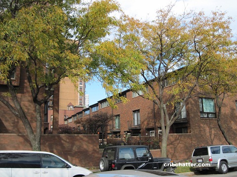
This 1600 square foot duplex appears to be in the midrise building behind the townhomes in this complex (on the left side of the picture above.)
The kitchen has white cabinets, stainless steel appliances and a back backsplash.
The two bedrooms are on the second floor.
It also has the features buyers are looking for with central air, washer/dryer in the unit and enclosed parking.
It’s been reduced about $50,000 since March to $399,999.
How important are the pictures for a property anyway?
Rosalba Salinas at Rising Realty has the listing. See the new pictures here.
Unit #314: 2 bedrooms, 2.5 baths, 1600 square feet, duplex
- Sold in January 1993 (I couldn’t find a price)
- Bank owned in December 2008
- Sold in September 2009 for $185,000
- Originally listed in March 2013 for $449,000
- Reduced
- Currently listed at $399,999
- Assessments of $456 a month (includes cable)
- Taxes of $5130
- Central Air
- Washer/Dryer in the unit
- Enclosed parking
- Bedroom #1: 24×15 (second floor)
- Bedroom #2: 17×12 (second floor)

I have the same coffee table from restoration! LOL
The 399K and the new photos do help!
A textbook example of how *professional* photography can enhance the first (or in this case, second!) impressions of your property, and not someone with an iphone. This is a lesson that applies to other markets as well; one that the Chicago Sun Times will have to learn the hard way.
The original photos aren’t complete garbage, just horribly lit and composed, but at least they used a wide angle lens to give us an idea of how the space flows together.
I knew people who lived here and I never liked the place much. The interior was very 1980’s cookie cutter – inoffensive but unmemorable. The bad part was the ugly lobby and the fact that you had to walk along a narrow outdoor passageway behind the lobby to get to your unit. It felt like going to a cheap motel. Very poor design, and I’m guessing it’s the same way now, though I haven’t been there in nearly 15 years.
I can see why a young couple might want to buy this unit, however. It has parking, CA, low assessments and taxes and a great location. The price is probably too high where it stands now. Maybe it will go in the mid 300s.
Better pictures do help but the unit is still pretty blah. I doubt new better pictures will solve the blahness factor of this unit.
The better photos are helpful to get more people to put this unit on their list of homes to see however it is the price reduction that will sell the unit! Like the bathroom tiles.
The unit owners should ban together and sell this parcel to a developer for a high-rise. It would be worth more…it would have views. Perhaps they could all get units for free in the new building.
I would not want to live next to a park w its noise of kids.
These people need some color in their life. The only color is from the clothes showing through the glass doors on the closet. Which is an odd choice. I hope the next owner will liven up the place.
Professional photography looks fake with their exaggerated colors and distorted field of view. A simple clean place with normal photography is more revealing to a serious buyer. The ‘pro’ photography will probably get you more attention from the non-serious crowd.