Live in Renaissance Splendor in Lincoln Park: 2042 N. Clark
Perhaps you’ve walked by this building on at 2042 N. Clark in Lincoln Park and wondered about it. I have. It has a distinctly renaissance look on the outside.
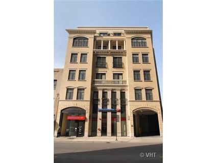
A top floor unit with a balcony and a terrace is on the market. The last unit to sell in the building was in June 2006.
There are only two units per floor.
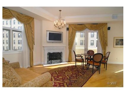
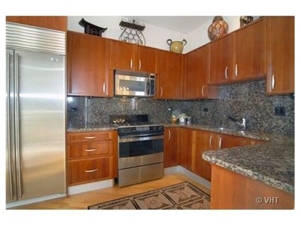
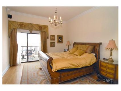
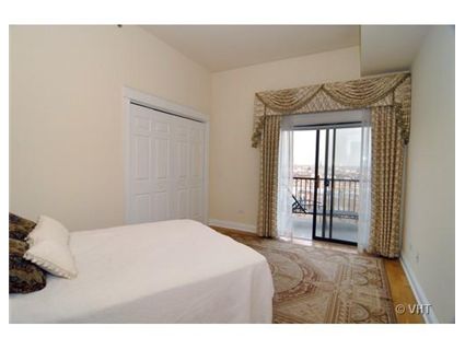
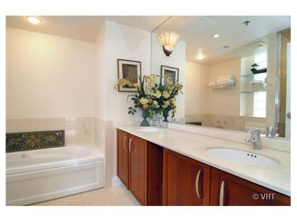
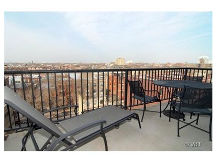
Unit #6N: 2 bedrooms, 2 baths
- Sold in June 2002 for $582,500
- Currently listed for $529,000 plus $70,000 for tandem parking
- Balcony at 16 x 8
- Terrace at 28 x 15
- Assessments at $410 a month
- @Properties has the listing
Wow–this is beautiful. And a very good price–anyone disagree?
I think that a buyer could hardball for $35,000 for the two spots if you’re preapproved/could offer a quick close, etc.
Yes, they are game-playing with the $70K. What they really mean is, “We want $599,000 for this place.” By pulling out the parking, they just leave themselves open to, “Wha? $70K for parking in Lincoln Park? Forget it–$30K.” Buy hey, since I’m a potential buyer, no prob. 🙂
Not a bad price, although I dont know what the square footage is. Kenworthy is right that you could likely halve the price of the “parking”. Clark isnt the best street to live on, and although the building clearly has a faux European look to it that seems to appeal to people in this part of the country, I personally think this building is very ordinary, blase (but my taste is very contemporary, so I dont like much of the uber-traditional housing stock here).
Is there a reason most places here have white walls? Except for the window treatments I would have thought this was a rental.
I’m by no means an interior design expert, but I was taught that color goes in the room, not on the walls. Others might have been told the same thing.
The fixtures are too nice for a rental. That’s what I typically look at. Formica is a dead giveaway.
That’s the windiest spot on the northside. If there’s any air moving at all, the clark side of the (former) midtown bank building is a total wind tunnel.
Just Curious,
Couldn’t agree more. The granite countertops extending to the wall below the cabinets just looks bizarre. The chandelier above the fireplace looks out of place as well. As for staging the property they didn’t do a great job: those drapes just look horrendous. Luckily for them all are easily fixed except the countertops extending to the wall (!)
anon, that alone is reason enough for me not be interested in the place any longer. There is NOTHING worse than a wind tunnel in this town!