Looking for Vintage? Go On a Vintage Lakeview Home Tour This Weekend: 510 W. Surf
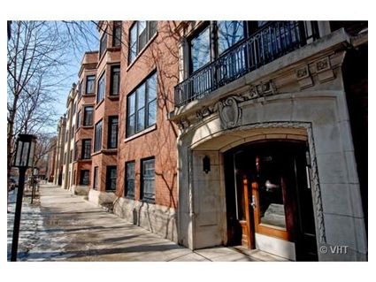
This 3-bedroom at 510 W. Surf in East Lakeview is one of 8 properties that will be open this Sunday, April 17, from 11-2 PM for a unique vintage home tour.
I meant to crib on this yesterday and forgot so I thought I’d do a rare weekend post so you vintage lovers would be aware of the opportunity to see a bunch of these properties on the same day.
Here are the properties that will be having an Open House:
- 932 W. Wolfram: Single family greystone, 4/4, listed at $885,000
- 559 W. Surf #400: The Green Brier, 2/2 listed at $385,000
- 559 W. Surf #209: The Green Brier, 1/1 listed at $215,000
- 330 W. Diversey #2409: Mies Van Der Rohe, 4/3 listed at $724,000
- 445 W. Briar #3: 3/2 listed at $650,000
- 3168 N. Cambridge #3N: 3/1.5 listed at $319,000
- 871 W. Cornelia #2: 2/1 listed at $255,000
- 421 W. Melrose #19A (by appointment only): The Eddystone, 3/2 listed at $509,000
510 W. Surf was built in 1915 by architect R.F. France. The building was originally called the “Chesterfield Apartments.”
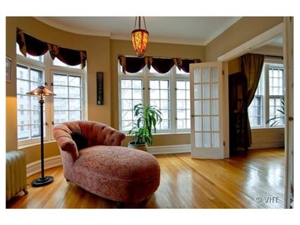
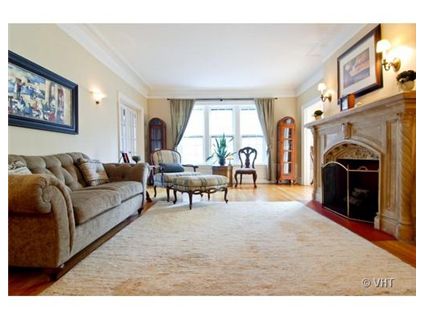
At nearly 2200 square feet, the unit has many of its vintage features intact including french doors and a Caen limestone fireplace.
There is an in-unit washer/dryer but no central air.
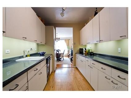
The kitchen has white cabinets but the listing says “Price reflects need for updated kitchen….” The bathrooms have been updated.
Originally listed in September 2008, it has been reduced $99,000.
If anyone goes on the tour of any of these properties, please check back in.
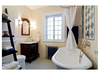
Jody Wise at Prudential Rubloff has the 510 W. Surf listing and is coordinating the home tour. See more pictures here.
And you can see it in person on Sunday, April 17 from 11 – 2 PM.
510 W. Surf #2: 3 bedrooms, 2 baths, 2187 square feet
- Sold in December 1990 for $210,000
- Sold in May 1998 for $296,500
- Sold in March 2000 for $410,000
- Originally listed in September 2008 for $599,000
- Reduced
- Withdrawn in July 2009 at $539,000
- Re-listed in March 2011 for $500,000
- Currently still listed at $500,000
- Assessments of $590 a month (includes heat and cable)
- Taxes of $7184
- Washer/dryer in the unit
- No central air- window units only
- No parking? It looks like it is rental parking nearby.
- Bedroom #1: 20×12
- Bedroom #2: 18×11
- Bedroom #3: 14×12
- Family room: 15×14
The kitchen is not the only room that needs to be updated.
What are you talking about? Both bathrooms have been updated. Sure- someone moving in would paint etc. But that is true of any property.
The listing is indicating that the kitchen would be the largest expense for a new owner and it looks that way from the pictures. Of course, someone could actually go and SEE the property and get a better idea.
Love those vintage condos.
Sabrina, as noted in previous Chatter, I DID see this property.
Sure, the bathrooms are fine. But not only does the kitchen need to be totally replaced, the so-called in-unit w/d is actually in the kitchen (not in a kitchen closet, but under a kitchen counter).
And, doczie is correct: the kitchen isn’t the only thing in need of help. While the place is generally in o.k. shape, lots of trim, areas around windows and ceilings, etc. looked like they were going to need more than just paint.
That said, as I expressed previously, this place is absolutely huge, and quite elegant. It really is sprawling, and feels every bit of the listed sq footage, and more. If it were just the kitchen issue, this place could be a real opportunity for somebody. But the thing that made it a non-starter for us would likely be the same for most would-be buyers of this unit: no parking.
I like getting by without a car much as possible, and actually lived on Surf for a year without a car. But this is Chicago, not Manhattan. The car is even more cherished here than the almighty SFH. And the vast majority of small families looking to spend $500k need to have a parking space – onsite, and guaranteed.
anonny, you called it! I love this condo and could easily get over redoing a kitchen (especially as I am particular about kitchens) and repairing trim. However, if I had the $500k+ to buy this place and redo the kitchen and furnish it I would NEED at least one parking space. I required that in my condo at a little over half the cost.
Otherwise, it does seem wonderful. Too bad.
It seems many of these units have a lot of books in them. It seems vintage lover’s are more bookish. BTW, I love the bathroom in the featured unit.
“anonny on April 16th, 2011 at 12:42 pm
Sabrina, as noted in previous Chatter, I DID see this property.”
It comes to aesthetic, though. If you’re looking at vintage because you love vintage, you need to understand issues such as parking, HVAC, et cet. You want stunning vintage features? Is that your aesthetic? Then there needs to be some personal sacrifice. Otherwise, I have a brand new 2/2 duplex up to sell you (with parking, with HVAC, and with a “fab” kitchen).
Good vintage is limited. The “perfect” vintage is near DoDo Bird status and is priced accordingly — aka, a sky-high limit.
That said, I’m going to try and check this property tomorrow; if I do, I will report back with my thoughts.
At this price.. best thing I can remember seeing here.
What about 559 w surf #400 (the greenbrier unit) also on the tour?
It’s 2000 square feet with C/A, in-unit W/D and parking available for $25,000. It also needs a new kitchen. It’s just $385,000. Although it does have a much higher assessment.
Here’s a link to 559 W. Surf.
http://www.rubloff.com/property/chicago/07763619.cfm
It has pocket doors like the unit at 1210 N. Astor. Also built around the same era and was originally luxury apartments for the rich (there was also a servants quarters on the top floor- just like 1210 N. Astor.)
The Mies Van Der Rohe unit at 330 W. Diversey that is also open today was just reduced from $725,000 to $699,000.
559 feels more expensive to me. Not in love with the units kitchen here but it is workable and unless you are completely obsessive about kitchens it is completely fine. The other one would be in pieces w/in a day. And the diff in assessments makes up the rest of the price dif. Maybe the windows in 510 need work, but something about them I really like, especially in the bathroom, and the slight curve on the corner wall is a nice touch.
The windows etc. are a different style. What if, gasp, the woodwork was painted white in the Green Brier unit? The white trim is usually considered more elegant.
Also- it usually doesn’t help a property to be vacant.
From what I see here, I’d take 559 over 510 for sure. Both kitchens do have to go I think and I wish you could take the bathroom from 510 and put it in 559. I like vintage bathrooms in vintage buildings. Just because you are updating a bath doesn’t mean you have to cover it all in home depot special marble everywhere.
The kitchen looks fine to me. It’s a place to do a job; close the door and get to work. I understand wanting exposed kitchens in open houses to look sharp but a closed off kitchen like this need only be workwise (as we say in the trades).
“What if, gasp, the woodwork was painted white in the Green Brier unit?”
With me, goes without saying.
The difference to me, in regard to the windows, is that 510 has the windows one next to the other which really makes you “feel” like you are in a much more open space.
The opening from dinning room to kitchen (photo 6?) is so unsightly. It looks like something we’ll see in a cheap cookie cutter condo. I wonder why?
Ze- that you WOULD paint it or not?
I saw a home renovation show awhile back on HGTV (think it was called “sell this house”) where a woman up in Toronto helped homeowners stage their homes that had been on the market for months etc.
They had a small budget for staging- and it usually involved paint.
Anyway- I saw an episode where she was in a vintage bungalow type house and it had a ton of the dark wood work (around the windows, doors, crown molding.) She told the homeowner they should paint it (even though the homeowner nearly died) because she said it would lighten up the space.
So they did it. Painted it white with light grey paint and, let me tell you, it was like a completely different house. The homeowners wanted to stay there afterwards! It was so elegant.
miumiu… cultural time period thing… the open kitchen is a pretty recent trend. Back in the days people wanted a complete formal separation of dining and kitchen. I am actually surprised for 1915 this is even that open.
One of the craziest things I see down here are multi million dollar apartments with practically no kitchen and in a condition that would leave you speechless.
ie… look at pic #6, pic #8 and then look at the kitchen in pic #9.
http://www.zap.com.br/imoveis/oferta/Apartamento-Padrao-3-quartos-venda-RIO-DE-JANEIRO-IPANEMA-A-Epitacio-Pessoa/ID-1748187
If you mentioned it to the sellers they would look at you as if you had just said something so gauche that your presence immediately need be removed. These people here don’t understand what going into a kitchen even means.
Bri.. I couldn’t agree more. My first house had these 3 huge beautiful windows opening up onto an enclosed garden but they were brown and depressing. Painted them white and it suddenly looked like a framed painting and made everything so much larger, open, and lighter. Over time I might paint a wall here and there to add character but I have a thing for walls, windows, cabinets white.
mm.. look at 5th from last pic too so you can see the whole thing. It is definitely a huge wtf!! when you come from a place like Chicago where for 600k you get a wolf and sub zero package… lol
Ze, I have no problem with kitchen being closed in a vintage unit, it is the door way which is bothering me. I would have thought it should be nice with some wood work around it as opposed to what it currently is.
Sabrina, I think I saw the same show. It killed me! Once woodwork is painted, it is next to impossible to undo. It would seem much better to me to leave it, or if the wood is too dark to restain it a different color but once it is painted the work required to undo it means it will always be painted unless someone replaces it with new woodwork.
I love exposed woodwork, and understand not all people do, but I think it is a big part of what makes some of us love vintage homes.
…it is the door way which is bothering me. I would have thought it should be nice with some wood work around it as opposed to what it currently is.
I wouldn’t think it too hard to frame in something there though. Would be more consistent with the rest of the house.
I have a feeling this could be an interesting couple of months of price discovery in the RE market.
“Sabrina on April 17th, 2011 at 7:19 am
What about 559 w surf #400 (the greenbrier unit) also on the tour?
It’s 2000 square feet with C/A, in-unit W/D and parking available for $25,000. It also needs a new kitchen. It’s just $385,000. Although it does have a much higher assessment.”
This property blew the featured Surf unit out of the water, IMHO. Out of the water.
I was so incredibly impressed with the 559 unit. It’s amazing, and I hope it sells for close to ask.
“Sabrina on April 17th, 2011 at 9:00 am
The windows etc. are a different style. What if, gasp, the woodwork was painted white in the Green Brier unit? The white trim is usually considered more elegant.”
Re: window quality/paint —
510’s windows are original wood painted white. They are old, although very charming. Means little since you’d probably want to have them redone, and it would be expensive to have them done in the same style.
559’s windows shocked me — they’re new thermopane done in wood to match the gorgeous windows and sills. It’s incredibly tasteful and very impressive.
559’s layout also beat 510’s for me.
Just my take. I could go on, but whatevs.
“I was so incredibly impressed with the 559 unit. It’s amazing, and I hope it sells for close to ask.”
The problem with this unit (#400 in 559) is the assessment. At $800 a month who can afford both the monthly payment AND the assessment in this location and for this building?
They probably aren’t- unless the price goes much lower. It’s been on the market a year already.
Let’s say someone gets it for $385,000 (including the parking.)
They put down 20% and get a 5% 30 year fixed.
You’re still looking at:
$1653 mortgage payment
$802 assessment
$615 taxes
Total monthly payment: $3070
And that’s WITH the 20% down payment which is $77,000.
And it needs a new kitchen. So that’s a minimum of $20k to $40k (on the higher side especially if you bust out the wall and open it to the den.)
How many buyers have all that cash laying around? Both for the downpayment and to make it all “new”?
They don’t.
But it is an amazing space, that’s for sure.
I agree with you on assessments, but 559 seemed like a better maintained building all-around, plus has a doorman and fantastic C/A spaces. You get what you pay for.
510 is more classic vintage with radiator heat (boiler) and I’m not sure on the tuckpointing, et cet. Smaller, lower assessment pool should a special arise.
To me, it balances out if you want longer term stability at 559.
To be quite frank, I don’t think either space ~needs~ a new kitchen. Granted, I’m one of those types that when considering vintage I look at unit quality rather than finishes. At 559, I wasn’t even drawn to the kitchen, but the giant window bay in the sitting room just past it. The windows and woodwork and everything else just move you past the kitchen there (which is centrally located and pretty cool). You really just have to see the unit to get what I’m saying; the pictures just don’t do it justice.
If anything, I’d want the *baths* from 510 put into 559. Those were a-ma-zing. The kitchen is perfectly fine for the ask at 559, imho.
“559’s windows shocked me — they’re new thermopane done in wood to match the gorgeous windows and sills. It’s incredibly tasteful and very impressive.”
These were replaced by a skilled window restoration firm, TMC Windows: http://www.tmcwindows.com/popups/grennbrier.htm
I’ve met with Tim Murphy, the owner, at the company’s shop to witness the restoration process and they do very good work. They are excellent at restoring old windows but they also can install new windows.
“At 559, I wasn’t even drawn to the kitchen, but the giant window bay in the sitting room just past it. The windows and woodwork and everything else just move you past the kitchen there (which is centrally located and pretty cool).”
You are unusual though. Most people aren’t paying $3000 a month for a barely rental grade kitchen (which is what it is.) The layout is such that the kitchen is NOT the main focal point of this property (that I agree.)
But there are plenty of people on Crib Chatter who are outspoken about having the cherry, granite and stainless (although they DID put in stainless appliances- which doesn’t really matter much in this case.)
Once you are over the “the wood work is amazing and look at the ceiling heights” and you’re actually LIVING in the condo- do you think you won’t be annoyed with that kitchen? Yes- you would be.
And, again, not many people have the money to spend after buying to put in a new kitchen- even if they IKEA it.
Which is why this unit is still on the market. By the way- it was listed for $400k last November. I don’t know what it was originally listed in April 2010. Maybe someone else can fill us in on the original list price.
But I still think it’s the assessment which kills it for most buyers.
“Sabrina on April 17th, 2011 at 3:08 pm
You are unusual though. Most people aren’t paying $3000 a month for a barely rental grade kitchen (which is what it is.) The layout is such that the kitchen is NOT the main focal point of this property (that I agree.)
But there are plenty of people on Crib Chatter who are outspoken about having the cherry, granite and stainless (although they DID put in stainless appliances- which doesn’t really matter much in this case.)”
This is on par with — if not better than — many “rental grade” kitchens. When dealing with vintage, sometimes I think it is best to have a functional “carte blanche” to reno to your own style rather than plop in generic “condo quality” only to have someone later say THAT’s unacceptable and want to have it done in a more high-end “match the vintage” style.
More, like you and I both admit: it isn’t the focus of this property, or even a focal point. The layout is great, functional, and versatile (booooo on the idea of opening it up to the bay) and 15K should do the job if you really want new cabs, counters, and a tile backsplash.
Plenty of CCers are outspoken about it; I agree. And? Plenty of people bought in new construction with grantite/cherry/SS (“ooo! pretty!”) and — oopsies — a whole lot of split-faced block. Or with a later special assessment. Or what-have-you.
The space is solid. The building is gorgeous, well maintained, and has a large assessment pool. The kitchen would really be the last of my worries here.
And yes; I could live with it every day, for even 5 years. Kitchen styles come and go (and in five, that look will probably go) but the building and unit are solid.
Well- there’s a reason it’s not selling, right?
People want move-in ready. They just do. You or I could live with that kitchen (but I’m in a rental right now- and my rental kitchen is better than that one and it’s nothing to write home about.) But if I were, again, sinking $3000 a month into a property- I’d want it looking pretty spiffy.
But it is an amazing property. On that we can agree.
But why do they have a doorman? Do they need one in that location? Does the Commodore (across the street) have a doorman?
Oh-one other thing about 559- is that that kitchen would not have been “original” to the unit. They were 4000 square foot units that were carved up into multiple units later. You can tell that it was basically thrown into that space (in what was probably just a large den of some sort.)
“Sabrina on April 17th, 2011 at 3:24 pm
Well- there’s a reason it’s not selling, right?
People want move-in ready. They just do.”
There are plenty of “move-in ready” McCrapboxes all over the land.
Sure, it’s been sitting. Several places have been sitting. The price may go down. Who knows? All I know is that it is in a killer location with great unit frontage and solid features. Who here would even talk about the amazing window quality (yeah, it’s important) but can look at a picture and go “WHERE’S THE GRANITE!?! 125K!!!”. I guess, you know, other than moi.
Some people love doormen. It’s why they buy in the 60s-70s LSD towers, after all, that definitely do not have the charm or character of this space. And 2/2s there are not cheap, either.
All in all, it’s fantastic vintage. Yes, the assessments are high. But you’re not likely to get a special assessment which is important for vintage.
To get back to 510 Surf, though, Sabrina, I will address this:
“anonny on April 16th, 2011 at 12:42 pm
Sabrina, as noted in previous Chatter, I DID see this property.
Sure, the bathrooms are fine. But not only does the kitchen need to be totally replaced, the so-called in-unit w/d is actually in the kitchen (not in a kitchen closet, but under a kitchen counter).”
Not true. It’s stacked and separate, and while in the kitchen, is not under a kitchen counter. Maybe it changed since anonny saw it, but it was definitely not in a base cab.
I’m a paint the wood person too. I just think the white looks more finished.
I think this kitchen could be saved with new cabinet fronts – the countertop looks like it could actually be granite or marble.
Definitely interested in this property. I think it is gorgeous based on the photos…
The kitchen is doable for now, and easy enough to change. Assesments aren’t bad considering they include heat and cable. Too bad about parking but depending on the rental options it’s not the worst thing (we currently rent behind the building next door for $150/mo., it’s fine)
And how are you guys comparing this and 559? This is a 3 bed, 559 is only 2.
Did anyone take a look at 932 Wolfram, if so, thoughts? To me it is a lot of space for the money and had some beautiful vintage features but am thinking the proximity to the el tracks might be a killer
T.S.: similar square footage. 529 is a 2/2 with a den.
I was the listing agent on this condo when it first came on the market. I can tell you hands-down that the number 1 hardest part of getting this condo sold was the lack of parking. Unfortunately, that was a complete deal-breaker for many people even though I gave them rental options in the area. The buyers of today, vintage-lovers or not, want dedicated, owned, attached (or nearby) parking when they’re spending over $500k.
The kitchen needs updating, yes, but some people love to come in and create their dream kitchen and that was appealing to some buyers with a creative vision. Often, when we would walk down the back stairs to see the patio, the downstairs neighbor’s back door would be open and I’d have them quickly peek in and see what they had done with their kitchen which had the same floorplan. There really is a lot of potential there.
Also, the washer/dryer is not under a cabinet… I’m not sure why someone thought that. It is in the kitchen, but it is at the end of the kitchen, stacked in an alcove.
I’m surprised no one has mentioned the fireplace… it is the original fireplace and is really beautiful (did I mention working) where the limestone has been fully restored (layers and layers of paint removed, back through the funky colors of previous decades).
Lastly, the master bedroom in this one blows most others out of the water. I’m actually surprised the master bedroom pictures are so far at the end, since that room to me is such a selling point. It is attached to what used to be a separate sun room (the wall has since been torn down so you have this lovely sitting area with a curved wall of vintage windows).
I’m not the listing agent anymore so you know I’m not just trying to “sell” anyone on it… these are just my thoughts and opinions based on my experience with the property.
Yes but ever with similar sq. footage a true 3rd bedroom is much more desireable. We have a 2/2 with a den now, but no closet makes a big difference. Also depends where it is in the floorplan.
And yes, THAT FIREPLACE! The best thing about this place if you ask me.
Did anyone go to any open houses?
“T.S. on April 18th, 2011 at 3:28 pm
Yes but ever with similar sq. footage a true 3rd bedroom is much more desireable. We have a 2/2 with a den now, but no closet makes a big difference. Also depends where it is in the floorplan.
And yes, THAT FIREPLACE! The best thing about this place if you ask me.
Did anyone go to any open houses?”
I went to both; I just prefer to be… polite… about 510 Surf.
I will say that at 510 Surf the front half of the unit is far more impressive than the rear half. Also, both baths are mastered, so there is no C/A bath for guests — so if you use all three bedrooms as bedrooms proper, you have that. One was furnished as an office/den, which is why I think 559 is the more impressive comp from a layout and maintenance perspective.
510 certainly has it on charm, and the Fireplace IS magnificent, though.
I could go on with my thoughts on 510, but — again — being polite about it. 🙂