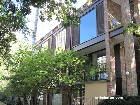
Love Mid-Century Modern? A 2-Bedroom Duplex at 235 W. Eugenie in Old Town
This 2-bedroom duplex at 235 W. Eugenie in Old Town came on the market in July 2015.
235 W. Eugenie is a mid-century modern building designed by Chicago architect Harry Weese (who also designed DC’s metro system.)
It was built in 1963 and has 23 units.
This unit duplexes up and has two decks on the second level, one facing north and one facing south.
It appears the bedrooms are also on the second level.
The listing says the kitchen has been renovated. It has white cabinets, stainless steel appliances, quartz counter tops and a kitchen island.
There is exposed brick in the living room (but you can’t see it in any of the listing pictures.)
This unit has 3 wall air conditioners but it does have in-unit washer/dryer.
It also comes with a coveted outdoor parking space, which is rare for Old Town.
It’s been reduced $5,000 in the last 30 days.
Given its prime location, why isn’t this selling?
Jason Rowland at Fairgreen Real Estate has the listing. See the pictures here.
Unit #T6: 2 bedrooms, 1.5 baths, 1300 square feet
- Sold in February 2010 for $352,500
- Originally listed in July 2015 for $429,500
- Reduced
- Currently listed at $424,500
- Assessments of $242 a month (includes exterior maintenance and snow removal)
- Taxes of $5926
- No central air- 3 wall units
- Washer/Dryer in the unit
- Exterior parking spot included
- Bedroom #1: 12×14 (second floor)
- Bedroom #2: 15×13 (second floor)

Even Darth Vader wouldn’t approve of this dated bathroom.
And way to ruin the look of the kitchen by adding the desk.
I think this place is a lot smaller than 1300sqft, probably why its not selling
You can quibble over a slightly outdated bath, or an item in the kitchen, but it is still a nice, easy-to-care-for place in a great neighborhood, even though I personally find it boring. It has outdoor spaces, is in a park-like setting, and the cost of ownership is low. The HOA is low and the taxes are modest for the price.
The major lack is central air, which might be costly and troublesome to install. This might be the deal-killer.
I just hope whoever acquires it rebuilds the staircase with a banister and handrail. Something I have always found annoying about modern architects is their common lack of consideration for basic safety and comfort, in order to achieve a striking visual effect.
To live in a place without a staircase banister, one must meet all of the following requirements:
-Physically fit with good balance
-Non-drinker/drug user. See “good balance” above
-No friends, no guests, no cleaning lady, etc. I wouldn’t want the liability of someone getting hurt on those stairs
-No dogs, free-range tortoises, or kids
I wonder if anyone meets those requirements.
Also, no old people, nobody carrying anything, especially a baby, nobody with an injury like a sprained ankle or arm in sling, that could mess with your balance.
The staircases that really stagger me are the ones I have seen in rags like Dwell and sites like Freshome that have open GLASS TREADS. Are they kidding?
See to much modern architecture with flagrantly unsafe features like pools cantilevered over steep drops, with no railings around the deck, and bathtubs with high, deep sides with no ledge, that are very difficult to get in and out of.
Speaking of dangerous modern homes, this article made me laugh: http://projectophile.net/2013/02/27/mid-century-modern-dream-homes-that-will-kill-your-children/
I like the concept of this building. But there’s lots of inexpensive detailing, and compounded with years of neglect of common elements, up close this building is in serious need of a lot of refurbishment-replacement-structural repairs. We looked at a duplex unit several years ago for ourselves, and though we liked the plan and size, were dismayed by the grunginess of common areas and building exterior. Outdoor parking lot was no thrill.
jenny, LOVE the article you linked/! It really captures the spirit of these types of homes.
Strange, the reason my mom bought her little MCM ranch in the 50s was for her children’s safety- it was all on one floor, on flat ground. Nothing to fall off of, down, or into.
Haaaa… great article. We had a pit to separate two rooms in our MCM house that we chose to mostly close up. Previous owners all raised kids there so I guess it was ok.
No way that was gonna work with our kids. Looked kinda weird and we also gained almost 150 Sq feet of usable space.
As a kid, I would have loved one of those open catwalk type things. I would have set up a zip line to the living room. Heck, I would love to set something like that up even as an adult.
At the very least, code would require a handrail running up the wall.
This townhouse has finally gone under contract.
It was reduced to $409,000.
Closed 405,500
This Harry Weese designed single family home in Evanston just came on the market at $599,900.
He definitely had a “style” because this house is very similar to these townhouses he designed in Old Town.
http://www.bairdwarner.com/property/48273737/3147-Grant-Street-EVANSTON-IL-60201