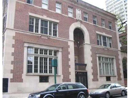
Paris in the 1920s? 50 W. Schiller in the Gold Coast
There is something unique about 50 W. Schiller in the Gold Coast. No two units are alike.

This 2-bedroom duplex has been renovated.
Here’s the listing:
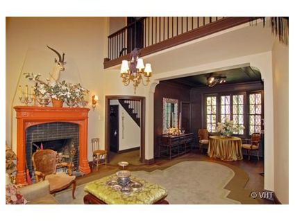
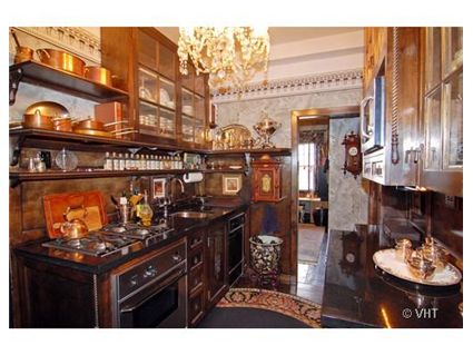
Exquisitely detailed, sophisticated & impeccably restored Andrew Roberi coop: Two bedrooms & small office area , 2 baths. Feels like Paris in the 20’s ! Kitchen has thermadore oven, Gaggenau cook top, sub zero refrigerator.
Lovely original wbfp, 2 story window in living room, curving walls, beautiful baths, central air! Charming courtyard garden. Taxes and heat included in monthly assessments! Parking nxt door..


Real Living Infinity has the listing. See more pictures here (check out the restored bathroom and more of the duplexed area)
Unit #H-2: 2 bedrooms, 2 baths, den, duplex, no square footage listed
- I couldn’t locate a prior sales price
- Currently listed for $679,000
- Assessments of $1172 a month
- Taxes of $5,292 (but apparently included in the monthly assessements)
- Space Pac cooling
- Bedroom #1: 17×11
- Bedroom #2: 9×11
not bad, kind of small and not sure many people would dig the “Paris” setup they have in there. I guess with taxes and heat included, assessments aren’t terrible.
I think the place would be worth a jump closer to $550k.
This is one of Chicago’s most unique apartment buildings – the space is great, if not huge. I think I’ve seen floorplans for the building on a blog somewhere.
Paris of the ’20’s? I’ll take Chicago of the 20’s. Give me an oversized bungalow any day of the week over this relic of the past. Puke.
cool looking place, but they need to get rid of some of the stuff everywhere. the place looks cluttered as hell with all sorts of old-timey knick-knacks…
That kitchen just made me throw up in my mouth a little bit.
Funny.. I always think the apartment in the Bourne Identity when I think Paris. This is the Brasserie underneath it I think.
Nice unit, the furnishings make it seem like a pastry that is too large and too sweet.
The whole thing looks like an over-the-top designer showhouse. I miss the Three Arts Club. While the restored vintage bathroom is charming, I think in this price range someone would want a Waterworks-version of vintage rather than the real thing.
This is a great building. Too bad this particular unit looks like a little old lady from the ’20s who is prone to wearing too much red lipstick and rouge (and thinking she’s still turns-heads ina good way). This palce is so over-done. DE-CLUTTER IT! Paint ALL the walls a neutral color to show off the beautiful bone-structure of this place.
Plus, it needs at least $25K – $50K in new floors; restored woodwork; restored fire place (limestone fireplaces in other units in this building were wisely not painted orange); and a new kitchen (which could easily be $50 – $100K all by itself); and every room needs painted. And, maybe a new bathroom.
If you covet a place in this building, there is another larger 2 bdrm here I looked at that was completely restored from the studs up— new everything while retaining and restoring all the bygone era’s charm. Plus, it has a beautiful octagonal sky-light in its 2-story atrium. Granted, it’s considerably more money, but it’s totally restored and has yet to lived in since its restoration.
This is a co-op. Luke, can you tell us what the assessments are – or what they are for the one you looked at?
Oh, sorry, they are right there, big & bold.
I’m especially fond of the ceiling fan in the bedroom and the stuffed “whatever animal that is” over the fireplace.
The kitchen looks fairly modern in the picture and might actually be OK if you strip out all the junk. And, what is that thing hanging next to the microwave that looks like a pull cord. Used to summon the hired help? I don’t think so, and the help should be IN the kitchen and the object of the call, not the initiator.
But, great location and great bones. Do you think an actual decorator was involved in all this, or is this an example of a homeowner run amok?
Maybe the help live in the basement and the owner wants to give the impression of being able to keep the house tidy and cook cordon bleu dinners without help?
Whoa..I feel like I can’t breath just looking at this place. Get rid of all that ornate crap and paint it neutral colors. This is the definition of cloying.
Awesome location, but too cluttered with owner’s personality and WHOPPING assessments.