Price Reductions in 508 W. Melrose in Lakeview
In January 2008, we chattered about several units at 508 W. Melrose in Lakeview that were struggling to sell for over $500,000.
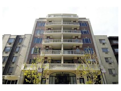
Five months later, they are still for sale and both have had price reductions.
- Unit #2D: reduced $24,500
- Unit #2A: reduced $20,000
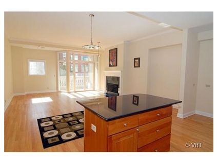
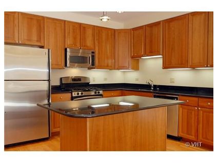
Unit #2D: 2 bedrooms, 2 baths, 1688 square feet
- Sold in June 2004 for $512,000
- Was listed in January 2008 at $499,000 (plus $35,000 for parking)
- Reduced
- Currently listed at $474,500 plus $35k for parking
- Assessments of $261 a month
- Rubloff has the listing
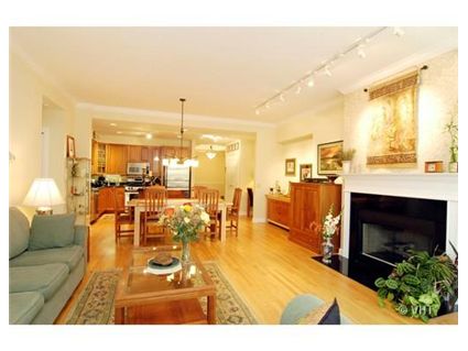
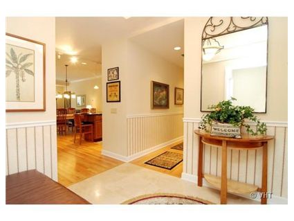
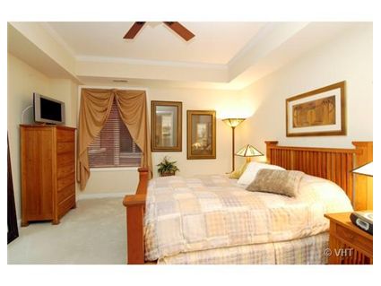
Unit #2A: 2 bedroom, 2 baths, 1568 square feet
- Sold in June 2004 for $533,000
- Was listed in January 2008 for $549,900 (plus $35,000 for parking)
- Reduced
- Currently listed for $529,000 plus $35k for parking
- Assessments of $336 a month
- Baird and Warner has the listing
Beautiful empty buildings. Unfortunately these are all too common if you walk around LP or LV and look for them. Just count the number of unlit units on a weeknight to see how the bubble is taking its toll.
They might be beautiful but they are overpriced. I have been looking at places in Lakeview and a 1600 sqft simplex without parking/extra 35k to park is just not going to sell right now. For 500k+ I expect more in Lakeview.
I looked at this building a couple of years ago and IMO it is an aesthetic disaster.
I was strolling down Melrose when I noticed the place. At first blush, I thought it was an older building that had been given a tacky facade reno, what with the balastrudes in combo with modern railings and sliding glass doors.
Strange, I thought, I don’t remember this building being here before. Then I realized it was new.
I thought, Egads, how tacky.
The developer gave me a tour- the open house was about to close for the day- and offered to drop the price $50,000 if I signed the deal then and there. The ask price at that time was north of $600K.
I was pretty underwhelmed by the units because, while large ,they were merely OK, but not really attractive- the layout was bad, and there was not the detail you would expect of condos in that range. The baths were big, but not exceptional. The detail that struck me as most “off” was a tiny little “computer niche” built into the wall by the entrance and across from the open kitchen- like you want to be locked into to using your computer in a tiny little niche with no arm space or drawer space or writing surface, right by the front door. There is no other use for this niche.