We Love Authentic Lofts: 913 W. Van Buren Penthouse
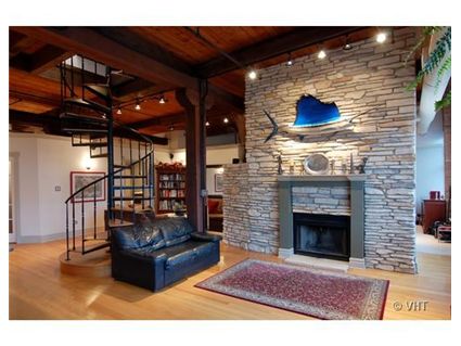
There’s something about a spiral staircase and brick.
Maybe I’ve seen too many movies.
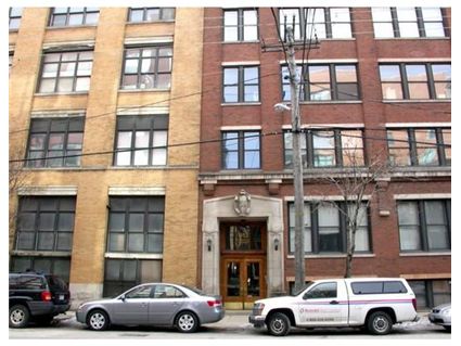
But you don’t find spaces like this one at 913 W. Van Buren in the West Loop everyday.
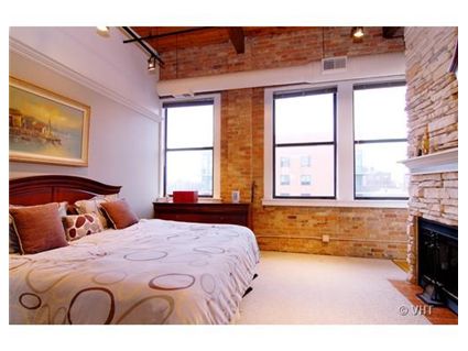
It has a 600 square foot rooftop deck (see below.) It also has authentic features such as no doors on the bedroom on the first floor (and no full ceiling heights.) Some like that- and some hate it.
I can’t find any pictures of what is at the top of those spiral stairs- apparently, a third bedroom.
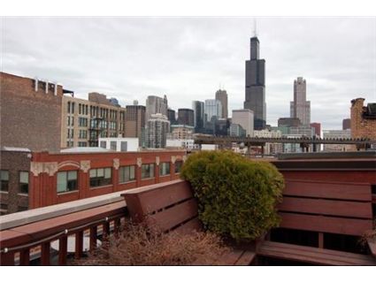
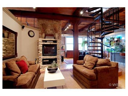
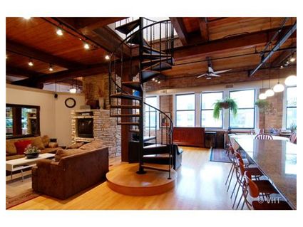
Unit #7B: 3 bedrooms, 2 baths, 1800 square feet, rooftop deck
- Sold in May 2002 for $290,000
- Currently listed for $549,900 (parking included)
- Assessments of $418 a month
- Baird and Warner has the listing
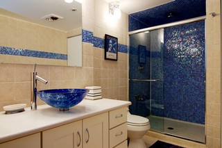
Aside from the futuristic looking sink which I would immediately replace, I
love this place. (and learned not to use symbols in comments)
I love this place, and I’m usually not a loft-lover.
But this place evokes the days when lofts were places for artists who did wacky, highly creative things in them and with them. Back in those days, the 70s, you got the rawest space you could imagine for unbelievably cheap rent, and you were free to do whatever with it, if you could pursuade the ownership to overlook the obvious liability issues of having people living with open elevators and lack of code compliance on things like egress, heat, stuff like that. Usually, you rented it as a “work” loft and secretly lived in it.
This place could be really exciting and interesting, with a little more work and imagination.
Appreciation rates are through the roof on this place. I’d stay away.
Yes, I love it, too–but no way at that price, not in West Loop. I don’t care how cool it is. I’ll wait until they’re asking $340,000, and then I’ll offer $320,000.
And since that will never happen…
Well, clearly, those of us who think it is monstrously overpriced have at least one dissenter: B&W site states it is already under contract.
Yup, under contract and in attorney review in under 26 days. Not bad!!!!
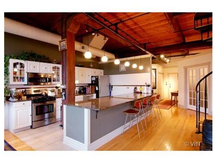
Cool place, but for the love of God why would they pick those awful white kitchen cabinets? They don’t go with anything else in the place. They belong in a farm house, not a loft apartment. Other than that, its an awesome space. But terribly overpriced, I agree.
White is in Pete. Everyone is doing white cabinets. Yes, these don’t exactly fit the general idea of a “hip loft,” but they are nice. I love White cabinets.
Very cool, indeed. Speaking of lofts and artists doing interesting things….
I am very much interested in just that for rent. Someplace probably in this neighborhood with an open loft feel that I can experiment with serious audio / video and computer equipment. So I would need to able to make a lot of noise, yet still feel comfortable entertaining and living easy from time to time, too.
Anybody have ideas or suggestions? If anybody has a sense for that, please let me know
Mjam,
If you’ll be using audio/video equipment, definitely look in a concrete loft, not a timber loft….your neighbors will murder you in a timber loft, where everyone hears everything.
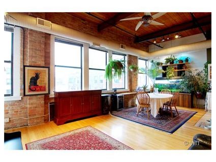
White cabinets are in? That’s like saying beige tile is in. Just because something is never UNpopular (because it’s neutral and inoffensive) doesn’t mean it’s trendy. Those cabinets look like they belong in some Shaumburg townhouse…they nailed suburban blah right down to the hideous plants over the cabinets. Why do people LOVE to put dangly leafy plants over their cabinets? Did they see it at Kirkland’s or something? Was it featured in the same crafter catalog that inspired wallpaper borders and led bored housewives to all try faux finishes that make their kitchens look like the inside of an olive garden? I am so tired of people with horrible taste putting those damn hand-blown raised vessel sinks everywhere! You can tell these people have no idea what they’re doing…the dining room table looks like it belongs in a cracker barrel, the fireplace looks like it was taken from some mountain lodge (complete with giant Marlin), the black overstuffed pleather sofa looks like it came from a dorm…then they’ve got pottery-barn-ish gray-blue wainscoting on the bar which for some reason they thought would look nice with some leopard brown speckled granite. I’m sure lots of people just love that ridiculous iridescent blue tile…they probably saw it on their last vacation in Vegas and thought it would really class up any bathroom. For a city with such great architecture, good interior design is very hard to find.
Danny,
I can’t help but correct you due to my expert knowledge in the field: That is a sailfish, not a marlin. I would not expect to see it in a mountain lodge at all. More like a tropical home. And given its small size, I would say it would be most at home somewhere in SE Florida or the Keys.
Maybe it migrated from the Keys to lake M. I mean if cougers from South Dakota find Chicago a nice place whose to say sailfish wouldn’t.
Also whats the point to criticizing their staging of the place? You’re not buying the place furnished so who really cares about the furnishings. Criticism that comes with the unit is relevant, but I could care less if they have sailfish mounted on their mantle or dangling plants or crappy sofas as they won’t factor into the purchase decision.
Bob,
I assure you that I think a billfish of any sort looks good on every wall.
G:
Your statement can do w/o the “I think”.
Thank you for your comment Bob. You are correct that you are not buying the unit with the furnishings, so who cares?
Please try and refrain from attacking someone’s interior decorating taste (paint color, furniture etc.) One man’s garage sale item is another man’s treasure.
Discussing the style of kitchen cabinets, appliances etc- is fine as long as it pertains to the overall discussion of the property.
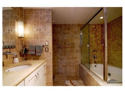
Alright, fine. Strike all the furniture comments from the record. But I stand by my disgust with the tile (in both bathrooms AND the kitchen floor), the cabinets, the out of place stone on the fireplace, and the sink.
anon,
You are correct. Thanks for the thoughtful comment.
Both of the bathrooms are photographed poorly–I bet they look better IRL, tho they still may not be to everyone’s preference.
The sink is no big deal, but I agree that I would not like it in anything other than a powder room.
I do agree that the cabinets are a mismatch for the rest of the space, but white cabinets ARE a neutral choice (and people are complaining about the other, non-neutral choices in this space), and the kitchen tile is a little mysterious in another bad photo.
I really like the stone fireplace, but do question why the mason allowed smaller stones at the bottom and larger on top–makes it clear that it’s a veneer (natural stone, still) which I think you want to avoid, for the sake of verisimilitude.
funky. I like. preferably at the may 02 price. I don’t know when I’m going to buy a place, but this listing has convinced I need two things: a spiral staircase, and a fish above my fireplace.