We Love Gorgeous Porches: 847 W. Bradley in Lakeview
Rooftop terraces are nice, but there’s something about a covered porch that is cozy.
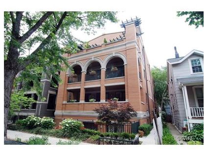
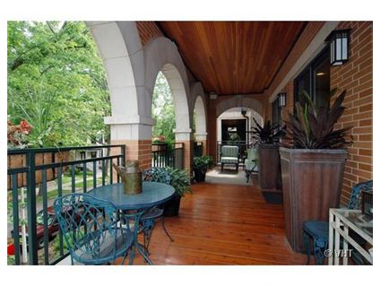
This 3 bedroom unit at 847 W. Bradley in Lakeview has one of those- in a gorgeous full length front porch.
The unit is in the hard-to-sell $600,000 to $700,000 price range though.
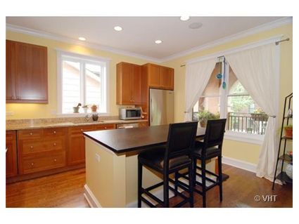
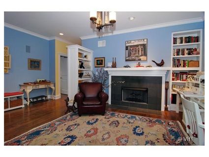
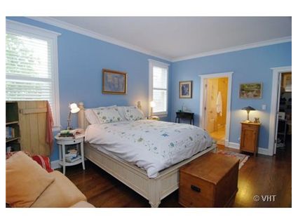
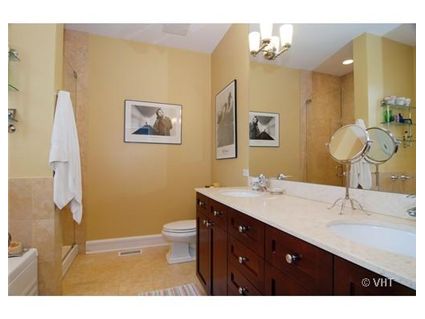
Unit #2F: 3 bedrooms, 2.5 baths
- Sold in August 2003 for $570,000
- Sold in April 2006 for $638,000
- Originally listed in February 2008 for $683,000
- Reduced
- Currently listed for $647,500 (parking included)
- Assessments of $220 a month
- Taxes of $7733
- Central air
- The third bedroom has been turned into a family room
- Rubloff has the listing (click on the link to see more pictures of the great porch)
Absolutely gorgeous… It’s nice to be reminded that there are many GREAT places in Chicago, so that I don’t need to feel the need to pounce on any one.
Repeating to self: will not buy right now. Will not buy right now. Will not buy right now…
They had me at the porch. Will not buy right now, will not buy right now, will not buy right now……
Great looking place. Two fireplaces too! Love the arches for the front porch. You definetly don’t see this everyday.
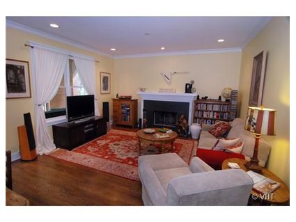
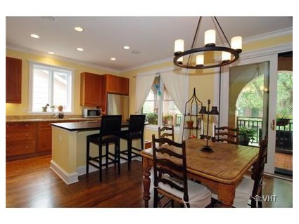
Great potential, but both living rooms and the porch are completely staged incorrectly. First, the paint colors are too nursery-like. Second, too much Pottery Barn furniture in one house! And, why is most of it against the walls? Two very nice fire-places are completely wasted on the current furniture arrangement. Plus, DE-CLUTTER both living rooms and the bedroom (way too much junky furniture). And, the flower pots on the porch are way too large for that space. it needs small cushioned rattan sette and some inviting cushions for the iron chairs. As for the 1990s kitchen and the overly large plain-box island, both should be immediate total gut jobs (and NO more oak or granite. It’s too much a cliche already!). Overall, this place is very nice, but more like $550K-575.
Just talked to a friend who knows this building. I didn’t immediately realize from the pix that this is NEW construction, not a rehab, and I’m guess from the sales history that it dates from 2003 – so the kitchen can’t be 1990s, except in style and general ugliness.
There is no yard whatsoever, other than the tiny little bit in front. The unit number 2F implies that this “front” unit isn’t “clear through” and that there is a “back” unit behind it. The “attached garage” is alley access from behind, and there is no rear yard apparently.
I might be mistaken but havent we already seen this one featured on Crib Chatter? I could have swore that I’ve seen that porch on here before. Maybe there is another property with the exact same look. Hmmm.
Nope- this unit has never been featured before. I’m sure there are other properties with similar balconies.
This porch covers the length of the unit, which is pretty rare.
“And, the flower pots on the porch are way too large for that space. it needs small cushioned rattan sette and some inviting cushions for the iron chairs.”
If you look at all the pictures on Rubloff the porch extends to the end of the unit and there is lovely couch and chair set at the other end of the porch (vaguely seen in the picture above) complete with cushions.
The porch looks great, and I love the extravagant flower pots.
I just wonder why some people are selling their great places after putting so much love into them.
I mean, they aren’t ALL in foreclosure.
this place would sell quickly if this str8 couple would let the gay boys in for a complete overhaul. a friend of mine lives in the identical unit in a different building by the same developer, very well laid out.
and sabrina, this has been on for a lot longer than spring of ’08. more like spring of ’07, they hid the original listing somehow.
The tipster who sent me the listing info on this unit didn’t have any listing for it in spring of 2007. It’s hard to “hide” that on the MLS these days.
Maybe you’re thinking of a different unit in the same building.
Yes, this place could have used a complete re-design.
I really, really wonder about the bookcase to the left of the fireplace- completely ruins the proportions of the rooms and just looks strangely placed,
This is a nice home, and while I agree that it looks as though they took advantage of their employee discount as a part time sales clerk at Pottery Barn, it could be so much worse. I am always amused when people buy homes they can barely afford and then have no money to put into making them an actuall home (not so much the case here, just a lack of taste). I love that there are interior critiques here on Crib Chatter. After all, first impressions are everything.